I Have Started Reading Listings For What They Leave Out
Four adjectives and not one number is a decision somebody made. Here is what I look for now, and what three of these actually looked like on a real body in a badly lit kitchen.
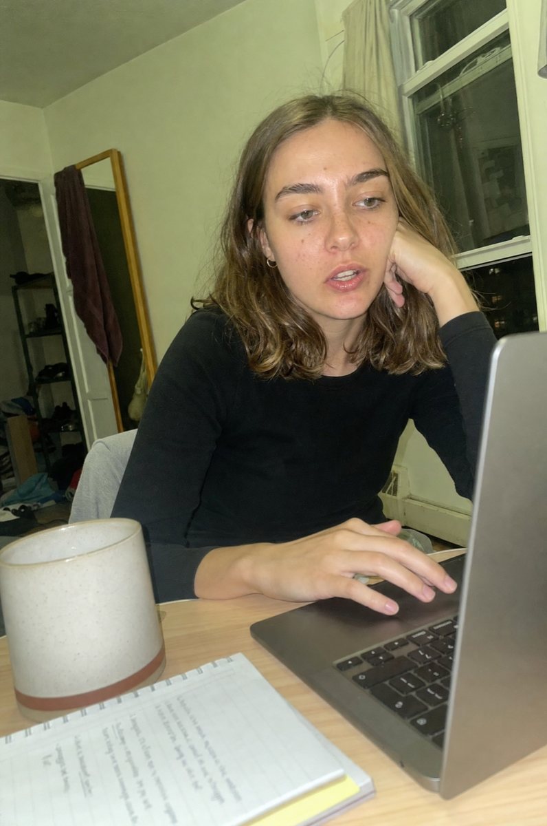
Premium. Cosy. Buttery. Luxe. Four words and not a single number, and for years I read that as a description. It is not a description. It is a choice about what not to tell you.
The absence is the information
A brand that knows what its fabric is made of puts the composition in the listing. It costs nothing to type. It takes one line. There is no version of this where it is expensive or difficult.
So when it is missing, it is usually missing on purpose, and the adjectives are standing where the number should be. Buttery is doing a job that 100% cotton would have done better, and the only reason to pick the weaker word is if the stronger one is not available to you.
What a photograph can and cannot lie to you about
A photo is fairly honest about shape. Length, neckline, where a seam sits, whether it buttons: those survive the edit, because changing them would take more effort than the photo is worth.
What a photo bends easily is colour, scale and drape. Studio light makes thin fabric hang like heavy fabric. A wide lens makes a crop look longer. A colour that is dusty in daylight photographs warm and rich against a white wall, and nobody has technically lied to you.
That is why the photos of me in these are here next to the brand's own. Mine are taken on a phone in ordinary indoor light with nothing corrected. They are less flattering and that is the entire point of including them.
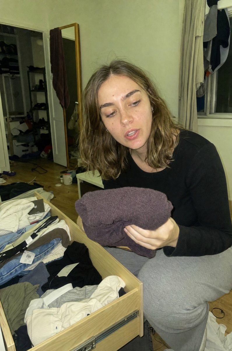
The three questions I ask before buying anything now
What is it made of, in percentages. Not a vibe, a number.
What does it weigh, in gsm, for anything knitted. This is the number that separates a substantial cotton hoodie from one you can see your hand through, and almost nobody publishes it.
What does it look like on a body in light nobody arranged. If the only images are studio images, you are being shown the best possible version of the drape and nothing else.
Where these passed and where they did not
One of the three below gives a composition. Exactly one. I am not going to pretend the other two did, because that would make this whole post worthless.
That is not a reason to skip them. It is a reason to ask before you buy, and to weight your decision towards the ones where the drape is doing obvious work in a photo that was not lit to help.
The one that answers the question
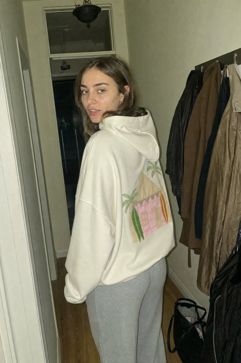
100% cotton. Not cotton rich, not cotton touch, not a blend with the percentage politely omitted. A number, in the listing, where a number belongs.
It matters beyond the pedantry. Polyester is at its softest the day it arrives and gets very slightly worse forever afterwards. Cotton runs the other way, which is why the good hoodie in your wardrobe is the old one.
The appliqué on the back is stitched rather than printed, which is the other thing worth checking on any decorated sweatshirt. A print cracks and lifts at roughly the point the fabric is starting to get good.
The one where the photo does most of the talking
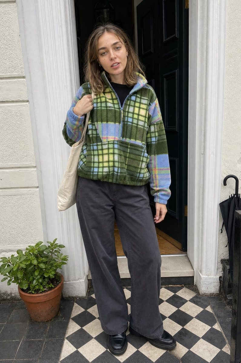
No composition published, so I cannot tell you what it is made of. What I can tell you is that a patchwork plaid is the hardest thing to fake in a photo, because the pattern has to line up across seams and panels and it visibly does or does not.
In an ordinary doorway in flat daylight, the sage and periwinkle stayed the colours they were in the listing. That is worth something. It is not worth as much as a composition.
The one where colour was the real question
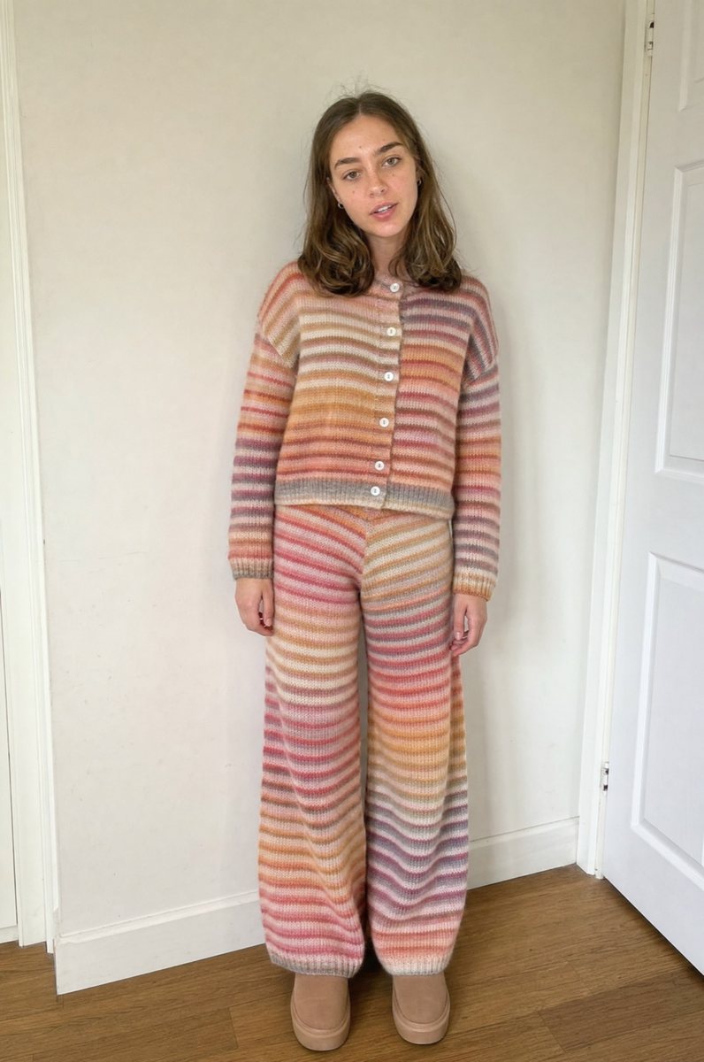
A four colour marled stripe is exactly the kind of thing studio lighting flatters, so this was the one I most expected to be disappointed by.
Against a plain wall in daylight the peach and apricot held, the grey ribbing at the cuffs and hem is genuinely there, and the pants keep the ombré rather than turning into flat bands. It photographs warmer than it is, but not dishonestly so.
Questions I was asked
- Is not published the same as is bad?
- No, and I want to be careful about that. It means unverified. A missing composition is a reason to ask, not a reason to assume the worst. The hoodie publishes one, the other two do not, and I said so rather than pretending otherwise.
- How do I know the colour is right?
- You largely cannot from a studio photo, which is why the photographs of me in these are taken in ordinary indoor light with nothing corrected. Compare mine against the brand's and take the darker reading of the two.
- What is the one question worth asking?
- What is it made of, in percentages. If the reply is an adjective, you have learned something useful anyway.
['None of this is about catching anyone out. It is about spending forty seconds on the part of the listing that is actually load bearing before spending eighty dollars on the part that is not.', 'Ask what it is made of. If the answer comes back as an adjective, you have learned something anyway.']
Nora